
Building the Jungle: How We Built This Site
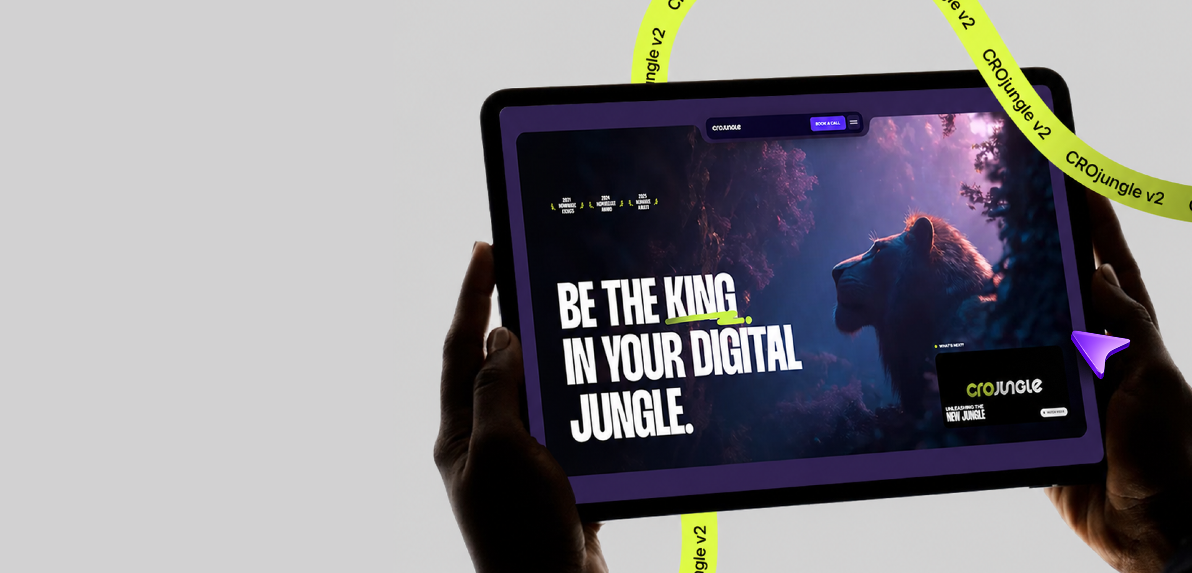
Most agency sites are assembled from templates. We built ours like a film. The full breakdown: the fly-through, the physics, and the rules we never broke.
Most agency websites are assembled. A template gets picked, a stock hero gets dropped in, three testimonials get pasted under a heading that says "Why Choose Us" (a question nobody was asking). Ship it, invoice it, move on.
We built this site the way a director builds a film. Storyboards before sets. Practical effects over cheap CG. One continuous camera move that the entire opening hangs on. And a rule we never broke: 60fps or it doesn't ship.
This is the behind-the-scenes. Spoilers ahead.
The opening shot
The first thing you see on this site is a flight through a jungle, and your scroll wheel is the camera dolly.
Here's the part most people get wrong: the obvious way to do this is a background video. Videos are also exactly how you get a hero that stutters, ignores your scroll, drains batteries, and plays at whatever speed the codec feels like. A film where the projector decides the pacing. No.
So we did it the practical-effects way:
- The fly-through is rendered out as individual frames from a 238-frame master. 54 frames on desktop, 30 on mobile, each one an optimized WebP.
- Every frame is decoded into an ImageBitmap ahead of time, so showing a frame is one GPU-cheap drawImage call onto a canvas. No per-frame decode, ever.
- A single scrubbed GSAP ScrollTrigger maps your scroll position to a frame index across a pinned 300vh track. Scroll fast, the camera flies fast. Stop, it stops. You are holding the camera.
Then the paranoid details, because the opening shot carries the whole first impression:
- Frame zero ships as a plain <img> poster with preload and fetchPriority="high". It paints instantly, it IS the largest-contentful-paint element, and it is pixel-identical to canvas frame zero, so the handoff is invisible. The audience never sees the set change.
- The remaining frames stream in with a concurrency cap so decoding never floods the network or the main thread while the rest of the page boots.
- If you scroll faster than the network (respect), the canvas falls back to the nearest already-decoded frame instead of flashing blank. The show goes on with a stunt double until the star arrives.
The score
A film without a score is just footage. On this site, scroll is the score, and two libraries conduct it: Lenis smooths the raw scroll input into something with weight, and GSAP plays every animation off that one clock.
The important word is orchestrated. Nothing here "pops in on scroll" independently like popcorn. When the hero opens, the box wipe, the content stagger, and the nav drop all move together on one timeline, cued by a single signal the preloader fires when (and only when) the opening sequence is actually ready. Intro timelines are built paused and wait for their cue. Sections rise from the ground once, on a 52-degree tilt, and never fold back.
That is also why the site has a preloader at all. It plays exactly once, on your first ever load. Navigate anywhere after that and a curved lime wipe carries you between pages, doubling as the loading screen, so the cut is seamless. Returning visitors never sit through the studio logos again.
Set design
Every visual decision on this site answers to a system, not a mood:
- The stage: deep purple (#312252), with every section a big rounded card floating on it. Cards are the unit of composition. Consistent gaps, generous padding, one modular grammar sitewide.
- The typography: Thunder, uppercase, solid white, at sizes most sites are scared of. Fluid from 40px to 96px with clamp(), so it is the right kind of huge on every screen.
- The lime: #c7f545 is a weapon, not a wash. It touches primary CTAs, active states, and exactly one word per headline. Scarcity is what makes it hit.
- The tokens: no hard-coded hex, no magic pixels. Everything references the design-token layer, so the whole jungle stays in tune from one source of truth.
Boring? Extremely. That boring discipline is what lets the flashy stuff feel intentional instead of chaotic.
The stunts
The set pieces, and what is actually happening under each one:
The eyes at the bottom of the page. Two lime slit-pupil predator eyes track your cursor, blink on a randomized scheduler, and glow in the dark among drifting fireflies. Canvas 2D, cursor position lerped so the gaze has muscle instead of jitter. The page's closing beat: darkness, then the jungle looks back.
The morphing sphere. A sphere of particles, laid out on a Fibonacci lattice (the same distribution sunflowers use, because math has taste), morphs into words and back. The naive version tweens every particle individually and melts your CPU. Ours runs ONE tween that lerps between position buffers. Visually identical, computationally free.
The light bloom. The dome on the Blueprint section emits light that follows your pointer. That is a raw WebGL fragment shader on a fullscreen quad, screen-blended over the artwork. No 3D library imported for it. A shader, four uniforms, done.
The dots that wake up. The glowing dot field behind the Brand OS card looks like a thousand elements. It is one canvas. We tried the DOM version first; a thousand nodes chasing a pointer lags no matter how cleverly you guard it. So: one canvas, dots stored as plain objects, physics flings on click, and it only repaints when something actually changed.
The drag carousel. The showcase carousel runs on real momentum physics: drag it and it glides with lerp-damped inertia, then snaps. No autoplay. Work this good doesn't need to beg for attention on a timer.
The magnetic CTA. The final call-to-action drifts toward your cursor inside its catchment zone. Reserved for exactly one element per section, because a page where everything is magnetic is a page where nothing is.
Buttons with a stunt double. Every primary button is a tiny 3D flip: the violet face rolls out, a lime face rolls in from below. Pure CSS. The same mechanic drives the nav logo swapping to the monogram as you scroll.
The physics
Here is the science that governs all of it. Browsers will happily let you animate anything. Animate the wrong things and the whole page has to be re-laid-out and re-painted every frame, which is where janky sites come from.
Our laws of motion:
- Transform and opacity only. These two properties composite on the GPU without touching layout or paint. Every animation on this site, from the hero fly-through to a button hover, obeys this.
- Promote the moving layer. will-change tells the browser which actors are about to move so it stages them ahead of time.
- Never leave an infinite animation on a blurred layer. A pulsing glow under filter: blur re-rasterizes the entire blurred footprint every frame. We learned this, we fixed it, we wrote it into law.
- Transformed ancestors lie. Once a section tilts in 3D for its entrance, the browser's geometry readings inside it are foreshortened, and scroll math built on those readings drifts. All measurement anchors to the untransformed wrapper. This one rule quietly protects half the site.
- Reduced motion is honored everywhere. Every marquee, scrub, tilt, and draw checks the user's motion preference and rests on a designed static state. Cinema is optional; readability is not.
And one law from the projection booth: background tabs pause the animation clock while timers keep running, which can wedge a page that was mid-sequence when you tabbed away. So the site runs a wake watchdog that detects the stale state on return and self-heals. You will never notice it. That is the point.
Post-production
Nothing here shipped on vibes:
- Every section change runs a scripted browser pass before it counts as done: full scroll-through at desktop, reduced-motion pass, mobile touch pass, zero console errors. The site gets test-screened like a rough cut.
- Every technique, decision, and hard-won gotcha lands in a living build log the moment it happens. The document is currently longer than some novels. Future work inherits every lesson instead of re-learning it.
- The analytics are ours. A first-party, self-hosted measurement layer instead of bolting on the usual third-party tracker zoo. We sell conversion; we measure it with our own instruments.
Why not the normal way
The honest comparison, category-wide (no names, they know who they are):
- The usual approach: pick a template, change the logo. This site: a design system built from zero, one grammar sitewide.
- The usual approach: a background video hero that plays at its own pace. This site: a scroll-scrubbed frame sequence; the visitor holds the camera.
- The usual approach: animations pop in wherever, whenever. This site: one conductor, one score, cued timelines.
- The usual approach: a thousand DOM nodes and a prayer. This site: canvas, shaders, and buffer math where it counts.
- The usual approach: "looks fine on my machine." This site: 60fps or it doesn't ship, verified per change.
- The usual approach: motion accessibility as an afterthought. This site: reduced-motion designed states, everywhere, always.
None of this is decoration for its own sake. Every set piece exists to make one argument before you read a single case study: craft compounds, and the team obsessing over frame decode order is the same team that will obsess over your funnel.
Roll credits
That is the film. Now you know how the shots were done, and knowing doesn't make the eyes less fun.
The jungle is watching.
Builds conversion machines for brands that are done being polite about growth. Writes down what actually worked.
 CROThe Landing Page AutopsyMost landing pages don’t die of one big wound. They bleed out through a dozen small ones. Here’s the post-mortem we run on every page, and what usually killed it.
 BrandBrand Consistency Is a Conversion FeatureTrust is built in milliseconds and spent in clicks. When your ad, landing page and checkout all look like different companies, visitors feel it, and leave before they can say why.