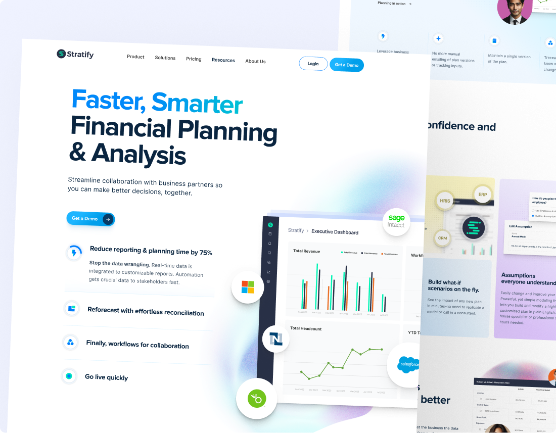

We gave a powerful FP&A platform a front door that converts.
Stratify's financial-planning software was powerful. Its website wasn't. We redesigned the whole experience and rebuilt it in Webflow, turning a complex product into a clear, modern site that converts.

A serious platform with a dated front door.
Stratify's software was advanced. Its website didn't show it. Finance buyers are careful. A tool that doesn't look credible doesn't get taken seriously. So we rebuilt the whole storefront: brand, UX, UI and Webflow build, module by module, until the site finally matched the product.
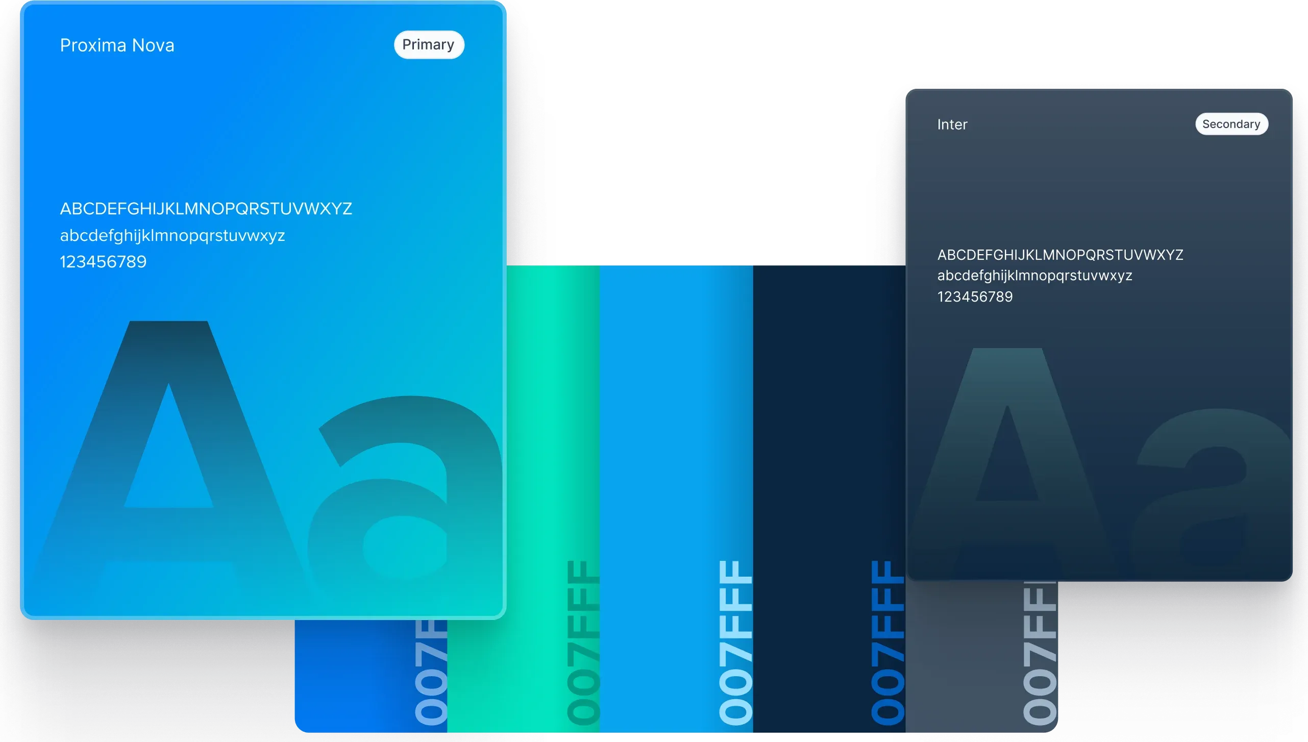
The foundations: Proxima Nova up front, Inter in support, and a palette built around #007FFF.
Four stops, zero detours.

Research & analysis.
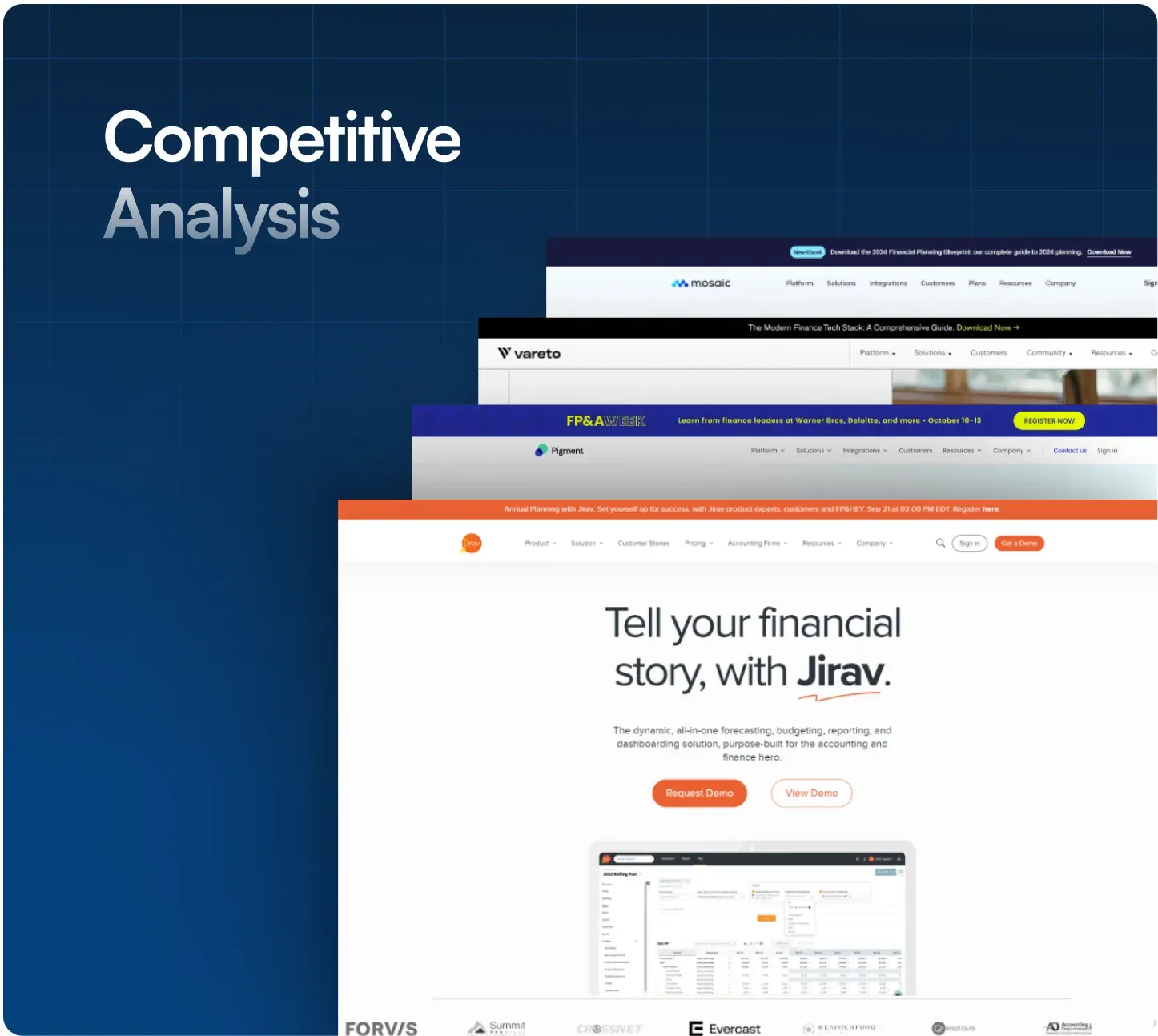
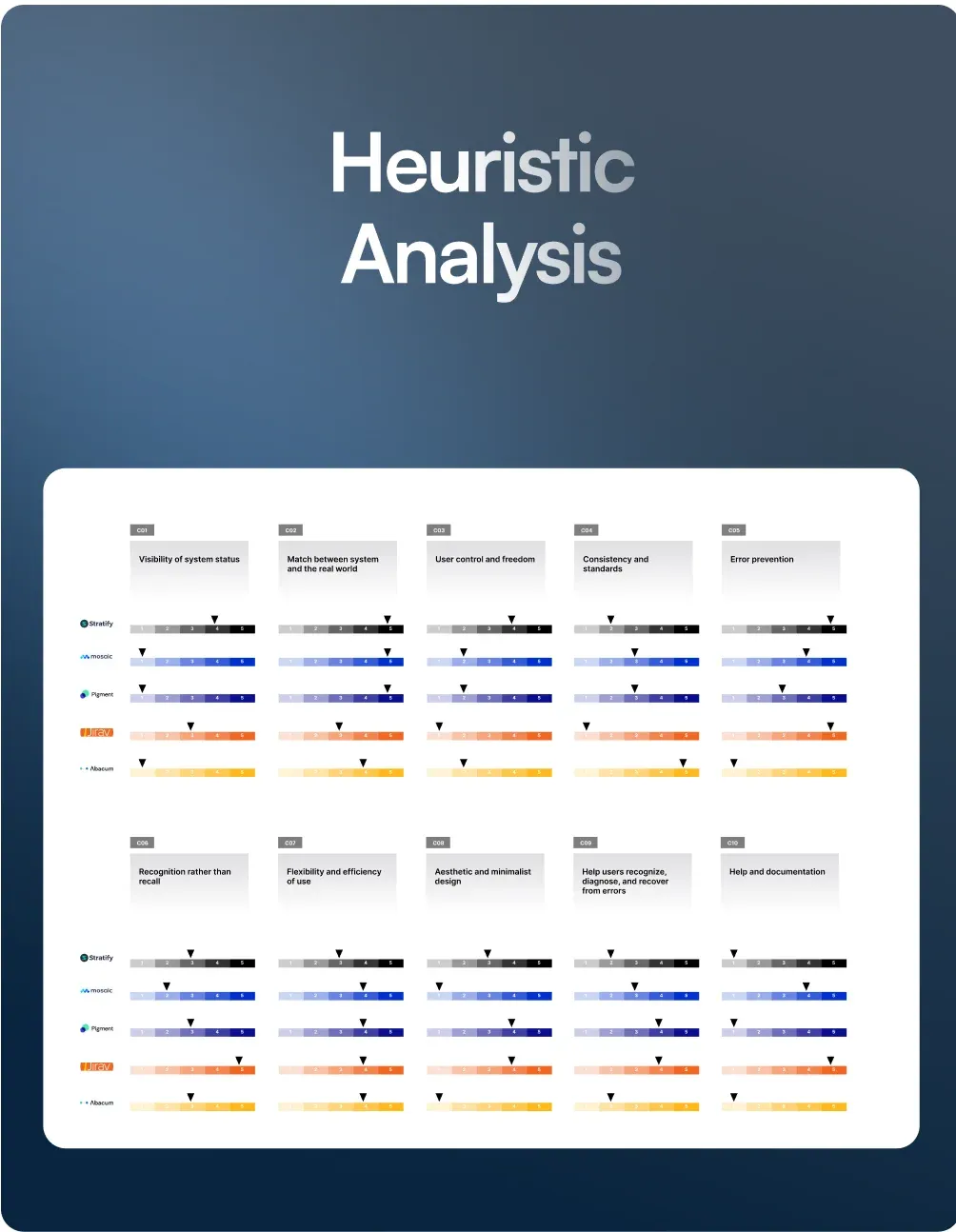
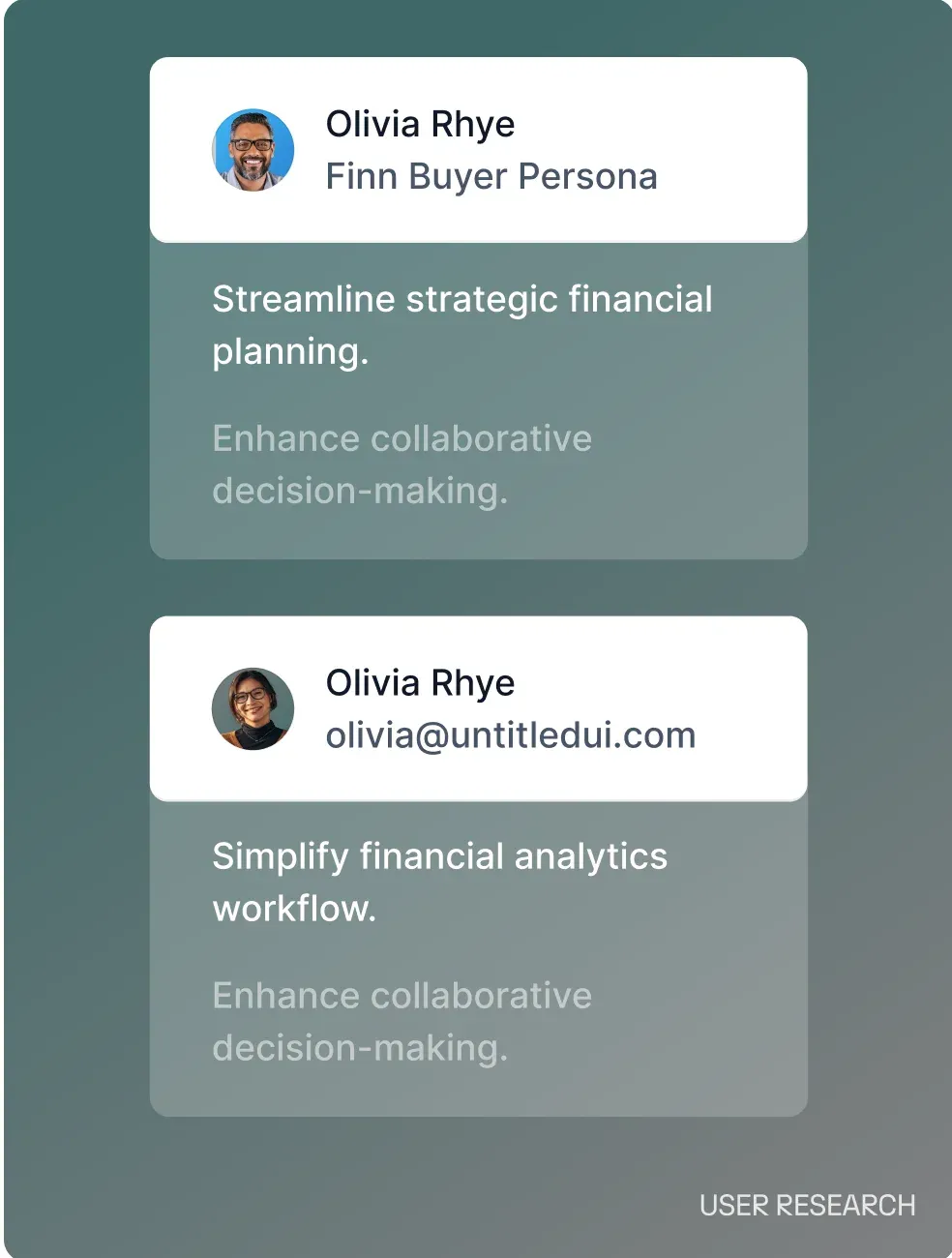
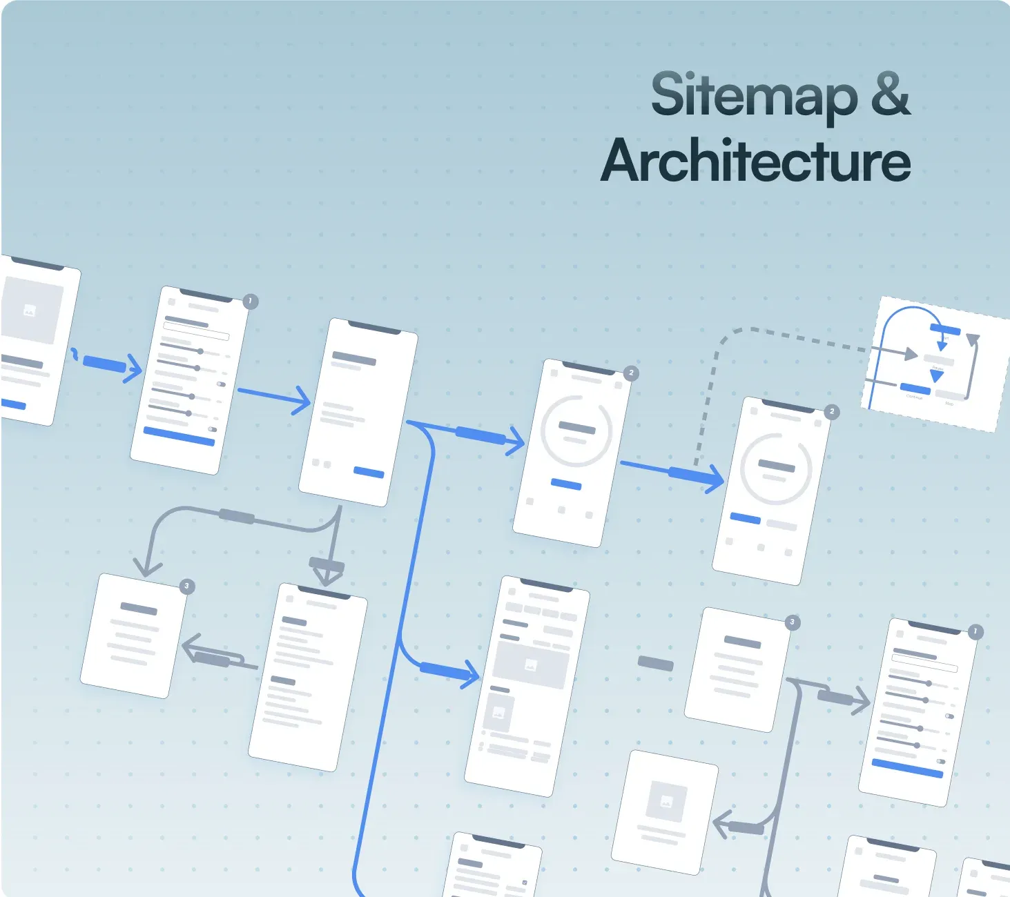
Before a pixel moved: a competitor teardown, a heuristic audit of the old site, user research with the people who actually run FP&A, and a sitemap that gives a complex product a simple spine.
User experience design.
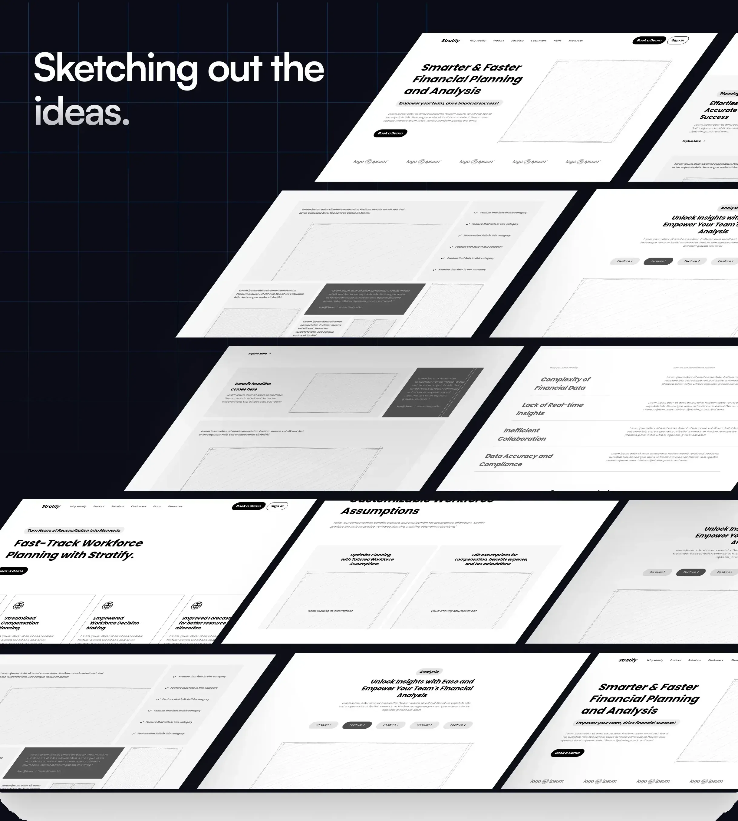
Every page argued in grayscale first. Structure wins before pixels get pretty.
User interface design.
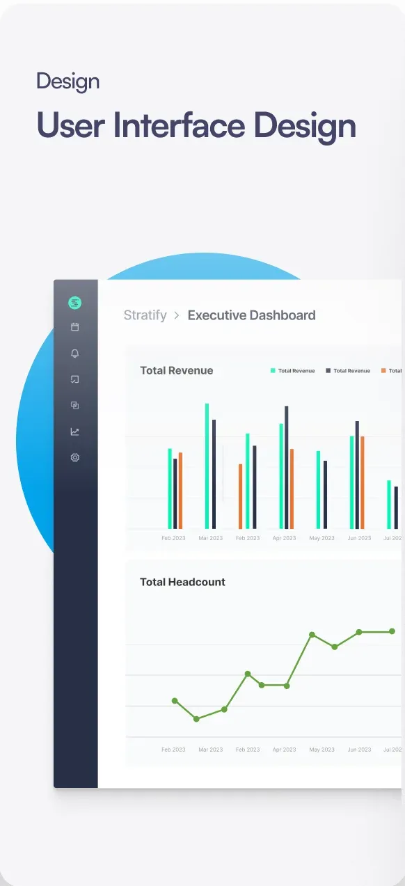
The winning wireframes got dressed, module by module: planning, reporting, workforce, expenses, content. Clear dashboards, calm blues, and numbers a CFO can trust at a glance.
Designing the core module.
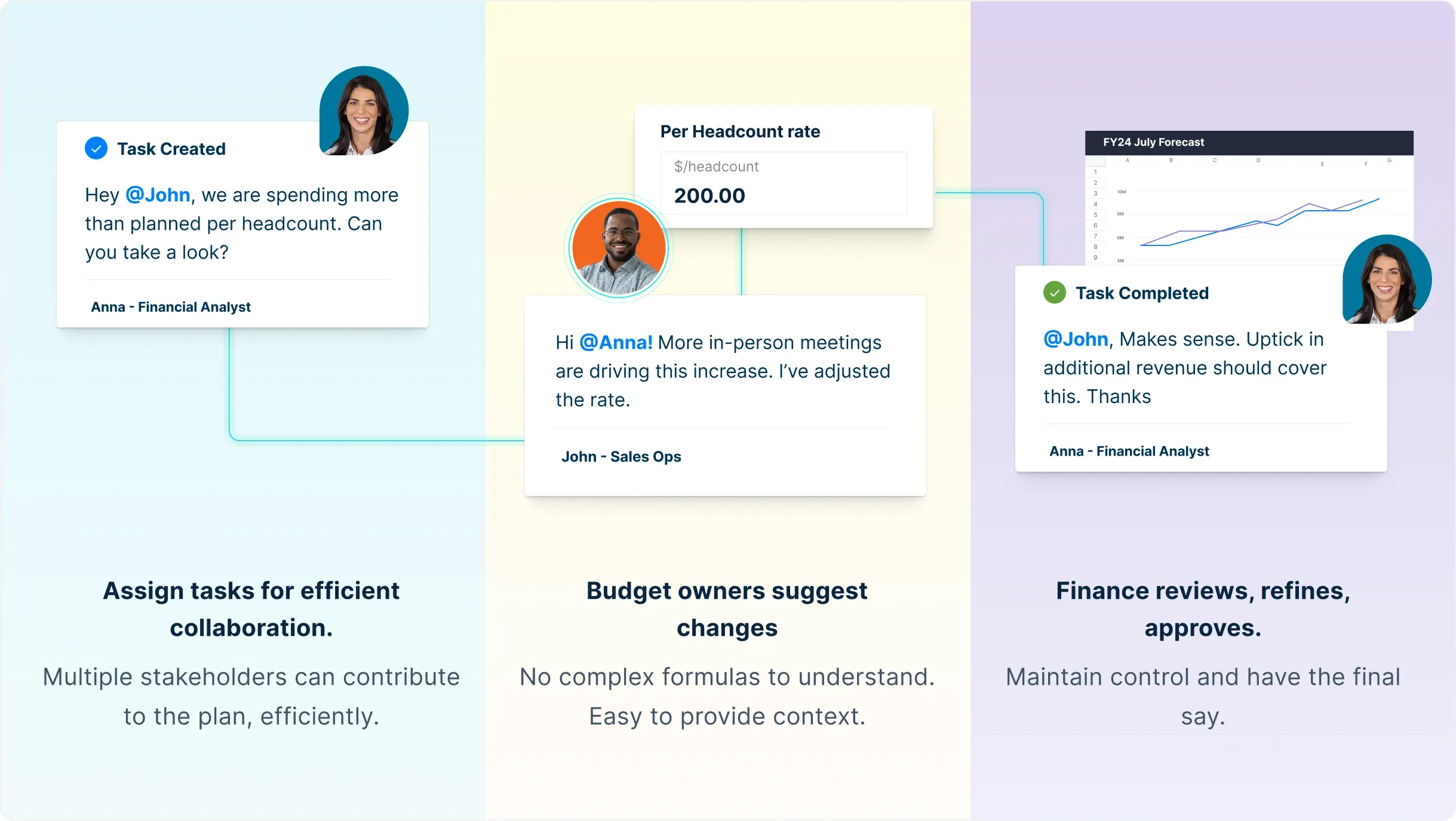
Planning is the heart of Stratify’s product, so its page got the deepest design treatment. We structured it as a guided story: initiate a task, budget owners suggest, finance approves. We turned dense planning tables into scannable moments, so a CFO understands the collaborative workflow before reading a word of body copy.
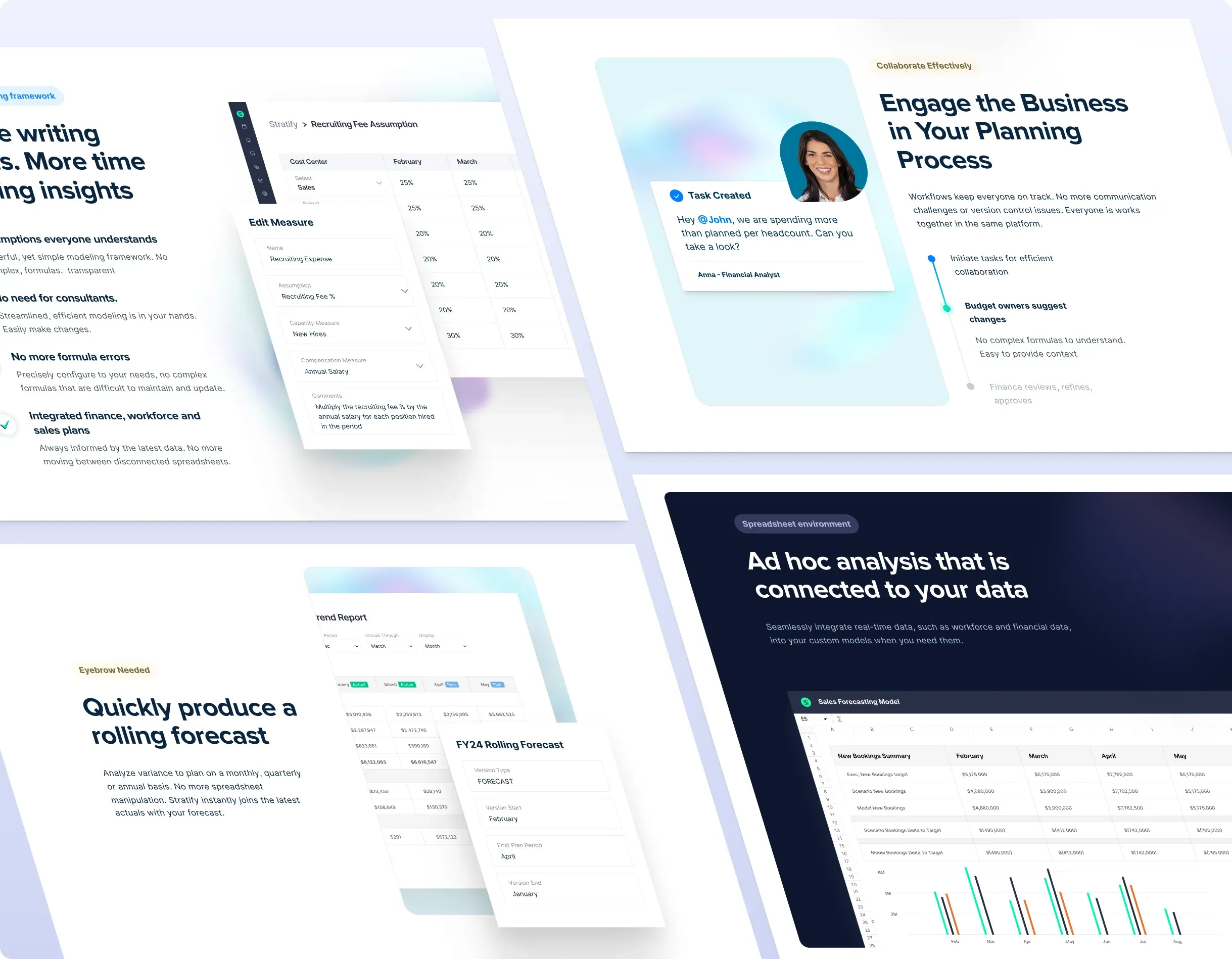
Reporting, shown not told.
For the reporting module we led with the outcomes finance teams recognize: a rolling forecast, a variance view, a month-end package. We sequenced real product screens with short claims. The page we designed demonstrates the reporting workflow instead of describing it.
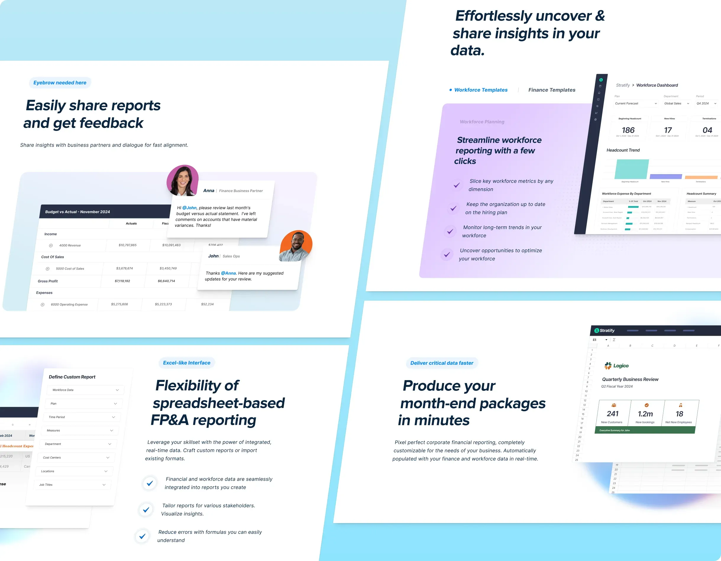
Answering the CFO’s first question.
Workforce planning is where FP&A buyers lean in, so we organized this page around their opening questions: hiring plans, compensation assumptions, headcount reconciliation. We paired each one with the exact Stratify dashboard that answers it.
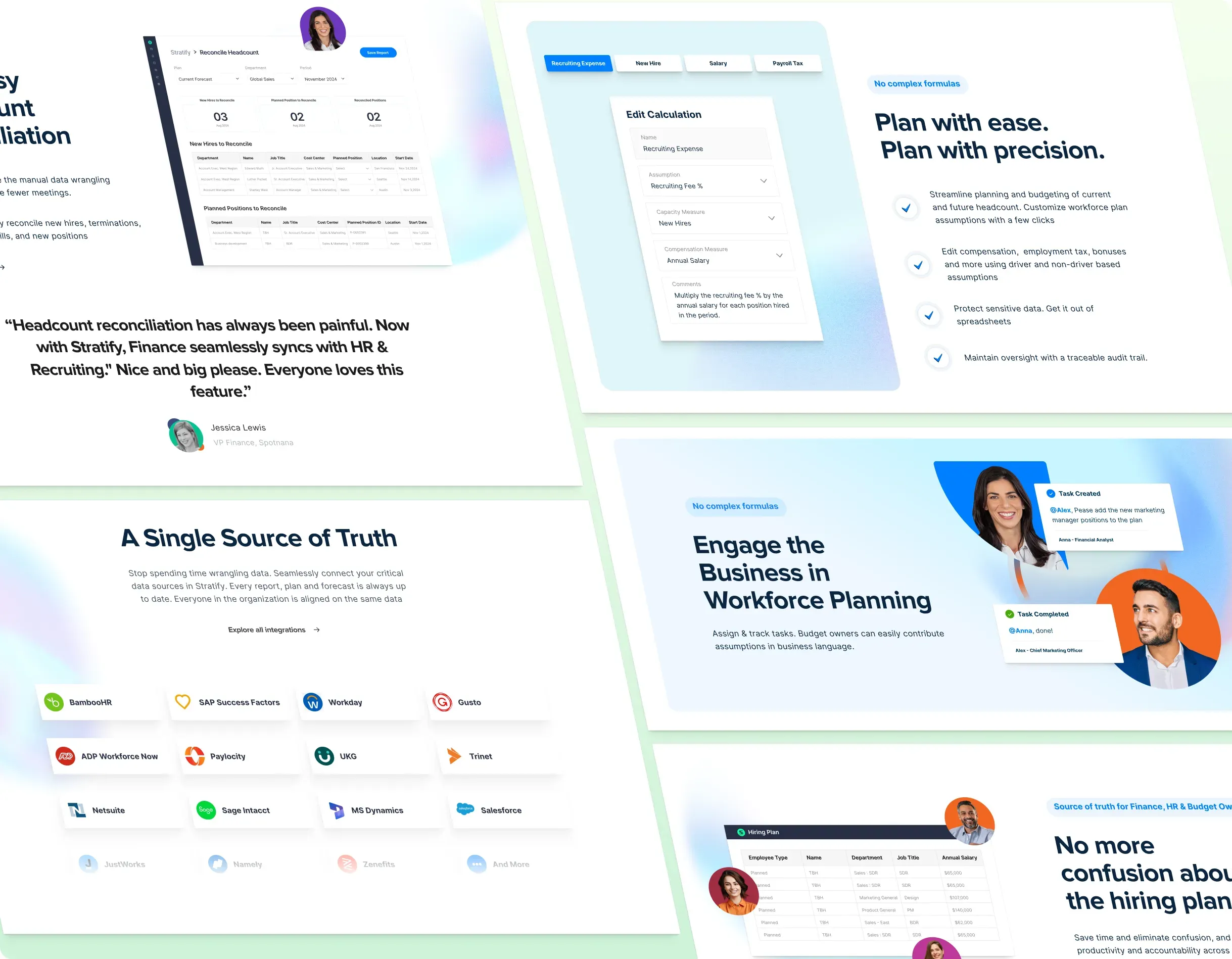
De-fanging the grid.
Expense-planning pages usually drown in tables. We built this one around a single worked example, a recruiting-fee assumption edited live on screen, so Stratify’s “no complex formulas” promise is shown rather than asserted.
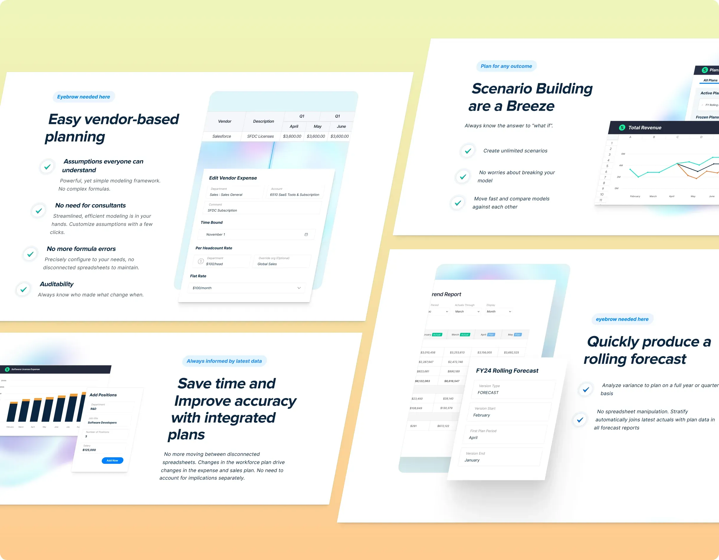
Content, designed into the funnel.
We treated the content hub as part of the conversion path, not an afterthought: finance-first categories, clear reading paths and article layouts that keep a skeptical FP&A reader moving toward the demo.
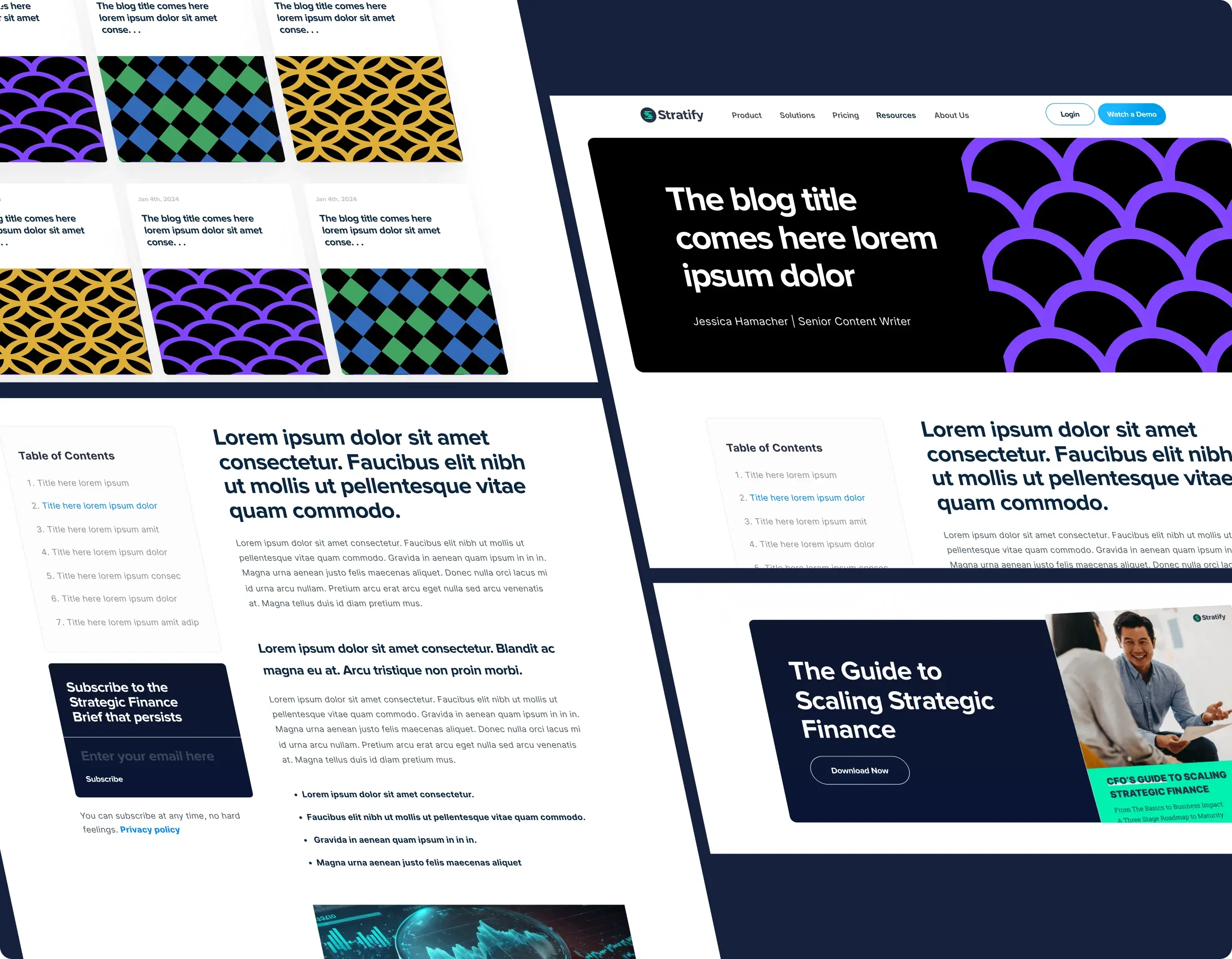
One system, every page.
Pricing, integrations, security, about. We rebuilt every supporting route on the same grid, type and component system, so wherever a buyer lands the story reads as one site, not a patchwork.
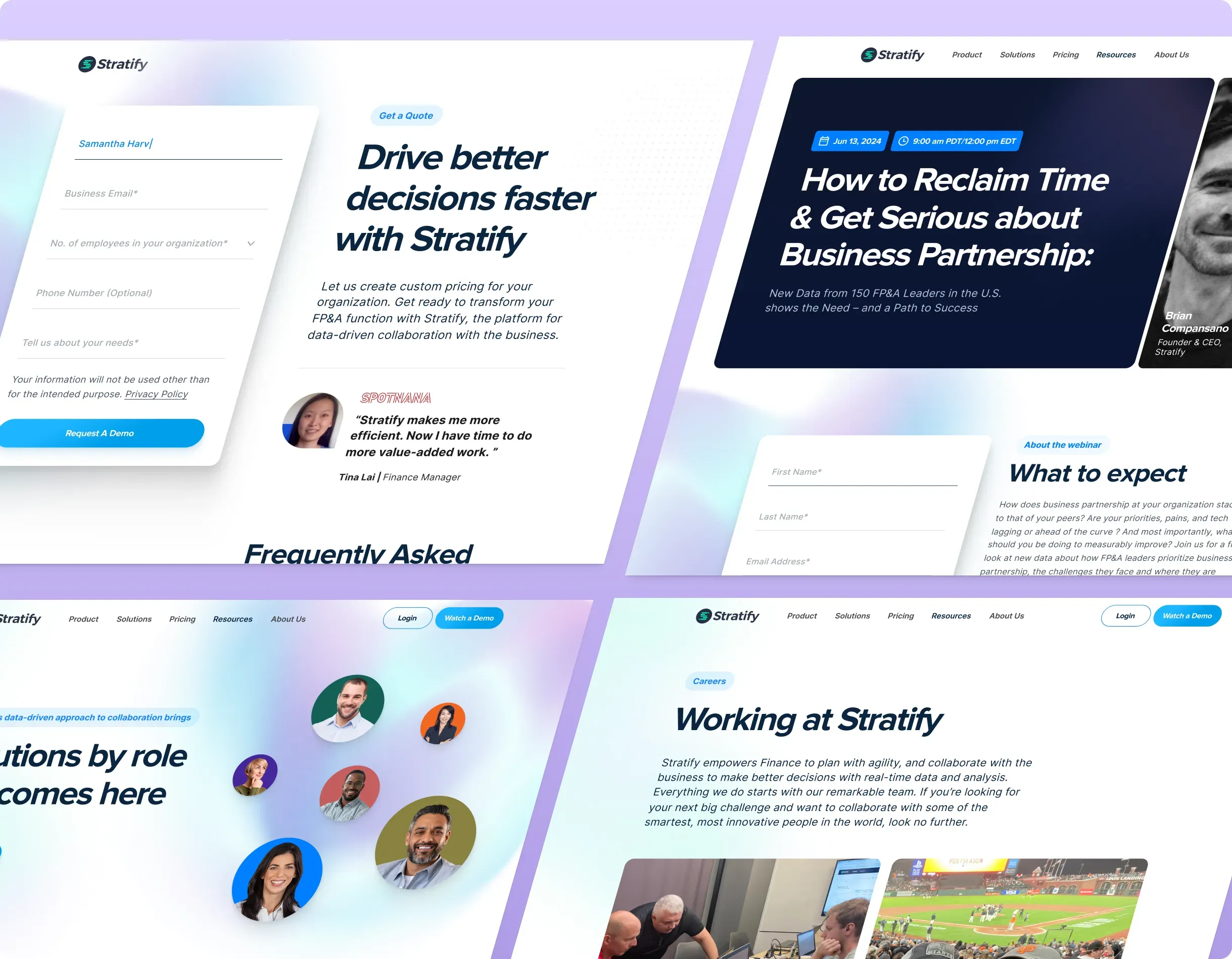
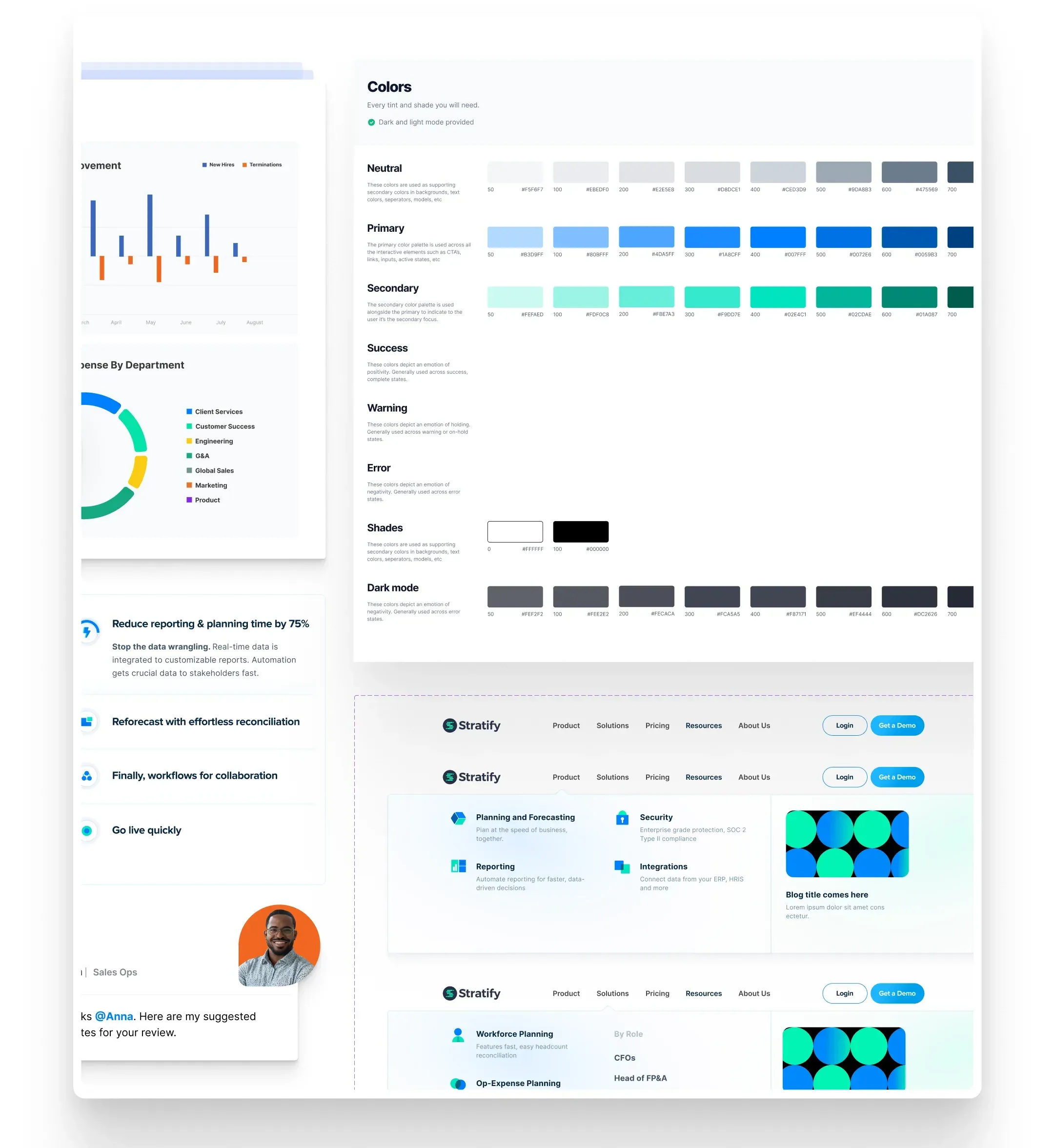
Every tint, token and state, documented.
A color system with dark mode, navigation patterns and component states, handed over as a system, not a stack of screens.